Documentary PhotographyPERFECT LIGHTCompelling Authentic Timeless

Silent Japan Gallery – Update

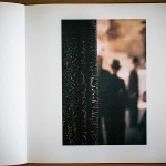
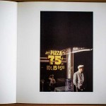
I recently updated the Silent Japan gallery, adding 27 new photographs to the original 18 that appeared in my first solo exhibition in 2010. Silent Japan is a series that was not started consciously but one that slowly took shape after reviewing the photographs that I had been taking on my trips to Japan. It is a series that has taken on a life of its own after its unexpected conception and one that I am actively pursuing whenever I have the opportunity to travel to Japan.

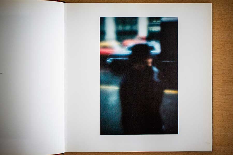
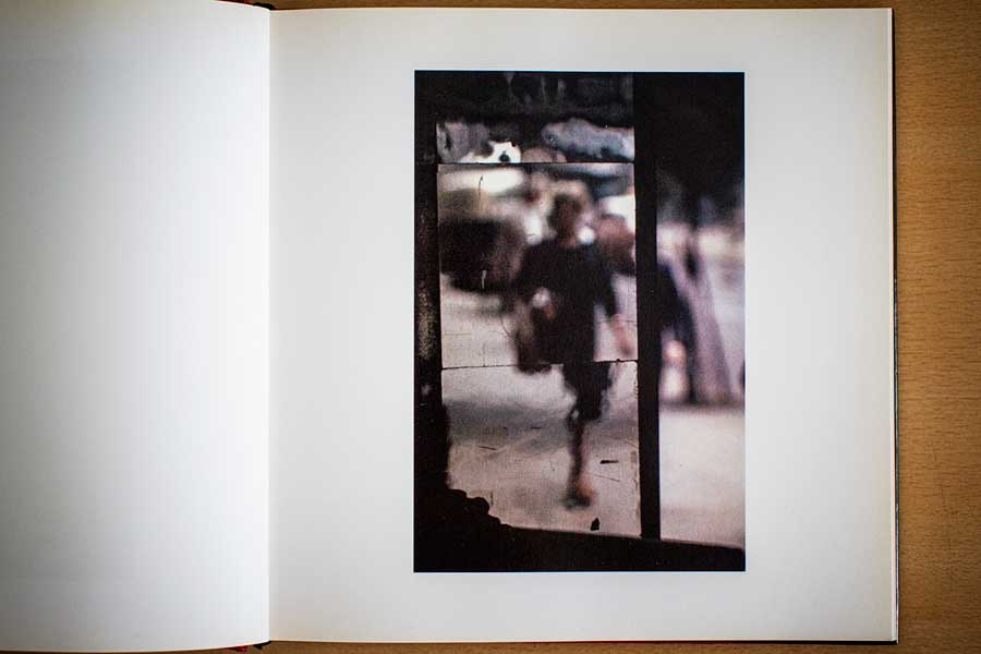
For those that are not familiar with the series, Silent Japan is a marked departure from my usual focus on people and their interaction with their environments. It features photographs of the Japanese landscape mainly devoid of people. Where I have chosen to include people, there is a sense of the transient nature of their passing, much like the landscapes they find themselves in. Taken over 4 trips to Japan in various locations on the main island of Honshu and the island of Hokkaido, the series features a quiet stillness that reflect my impressions of the land. The photographs capture pockets of tranquility as well as the solitary, simple and austere beauty of the places in Japan that were visited. By focusing on the natural, ordinary and often rustic objects, the viewer is invited to discover the innate beauty to be found in the exquisite patterns left by the flow of nature and man. The series is rooted in the Japanese aesthetic of wabi-sabi that is commonly defined as the beauty of things imperfect, impermanent, and incomplete.

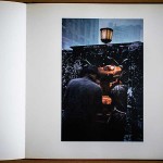
“All around, no flowers in bloom

Nor maple leaves in glare,

A solitary fisherman’s hut alone

On the twilight shore

Of this autumn eve.”

~ Fujiwara no Teika (1162-1241)

All the photographs in the series are available for sale in limited editions of 5. The series is printed on archival and acid free Washi (Japanese handmade paper) adding to the feeling of wabi-sabi with the paper’s organic deckled edges and subtle surface texture. 8 new photographs that were taken last year are currently on display for sale at Bizlink @ The Cathay (2 Handy Road, #03-04/05. Singapore 229233). 5 out of the 8 photographs on display are from a special sub-series titled Silent Japan 3-11. This special sub-series features photographs that, in some way, capture my reflections on the March 11th 2011 Japan earthquake and tsunami. The Silent Japan 3-11 photographs are also printed larger at 14×14″ on an A2 sized piece of Washi compared with the rest of the series which is printed at 8×8″ on an A3 sized piece of Washi.  If you are in the area, do drop by for a look. Please contact me for enquiries on print sales.

Saul Leiter: Early Color

A friend of mine recommended that I check out Saul Leiter’s photographic work quite some time ago and it was on my ‘to do list’ for over a year. I finally got hold of a copy of his book Saul Leiter: Early Color and have been browsing through the book over the last two weeks.

Some excerpts from the book’s blurb:-

Although Edward Steichen exhibited some of Saul Leiter’s color photographs at the Museum of Modern Art in 1953, for forty years afterwards they remained virtually unknown to the art world. Saul Leiter: Early Color provides the first opportunity to see a comprehensive presentation of images by one of photography’s great originals.

Leiter moved to New York in 1946 intending to be a painter and through his friendship with the abstract expressionist Richard Pousette-Dart he quickly recognized the creative potential of photography. Though he continued to paint, exhibiting alongside Philip Guston and Willem de Kooning, Leiter’s camera became — like an extension of his arm and mind — an ever-present interpreter of life in the metropolis.

. . . for him the camera provided an alternative way of seeing, of framing events and interpreting reality. He sought out moments of quiet humanity in the Manhattan maelstrom, forging a unique urban pastoral from the most unlikely of circumstances.”

I am glad I took up my friend’s recommendation to check out Leiter’s work. Saul Leiter: Early Color features 100 colour photographs that Leiter took mostly in the 1950s. I cannot think of many street photographers from the 1950s to 1970s who worked well in colour. The only one that comes to mind is Helen Levitt  (see Slide Show: The Color Photographs of Helen Levitt).

“I started out as a fashion photographer. One cannot say that I was successful but there was enough work to keep me busy. I collaborated with Harper’s Bazaar and other magazines. I was constantly aware that those who hired me would have preferred to work with a star such as Avedon. But it didn’t matter. I had work and I made a living. At the same time, I took my own photographs. Strangely enough, I knew exactly what I wanted and what I liked.” ~Saul Leiter

Leiter, who is almost approaching 90, only got his personal photographic work recognized (and deservedly so!) fairly recently. Leiter’s photographs are a treat to look at. Many of his photographs look like paintings due to the almost abstract way he used the colours and tones he saw. He often used expired film as well due to the unpredictability of the color shifts. I enjoy his use of reflections as well as the strong vertical lines he employs in the framing of his photographs. The majority of his photographs are framed vertically and this book would be an excellent lesson on how to effectively frame photographs vertically.

“I spent a great deal of my life being ignored. I was always very happy that way. Being ignored is a great privilege. That is how I think I learnt to see what others do not see and to react to situations differently. I simply looked at the world, not really prepared for anything.

In order to build a career and to be successful, one has to be determined. One has to be ambitious. I much prefer to drink coffee, listen to music and to paint when I feel like it.” ~Saul Leiter

Saul Leiter: Early Color (available on Amazon US and UK) is released by Steidl publishing and is on the small side (20 x 20cm clothbound hardcover with dust jacket at 168 pages with 100 color plates). This format seems to fit Leiter’s photographs well. A much cheaper option for an introduction into Leiter’s photographic work is the book Saul Leiter (Photofile) (available on Amazon US and UK).

All photographs from the book featured on this post © Saul Leiter

 [This article was first posted on The Invisible Photographer Asia on 12th July 2012]

Wedding: Brandon & Shiao – Part 2 The Details

I have always described my style of wedding photography as photojournalistic with my coverage focusing mainly on people. A minor portion of the coverage does go towards capturing some of the details of the wedding. Capturing the details (e.g. the rings, shoes, decor, etc) are important to create a good balanced coverage, but should never supercede the focus on the people (especially the bride and groom).

The best kind of details enhance the overall atmosphere of the wedding which was the case in Brandon & Shiao’s wedding. The highly talented pair, Joyce and Weiyan, from In Merry Motion designed and showcased absolutely stunning decorations and embellishments for their wedding. If you have seen Part 1 of Brandon & Shiao’s wedding as well as their ROM photos you would have caught glimpses of their handiwork. Also involved was freelancer Joanne Lim, who worked with In Merry Motion to come up with all the graphic design (e.g. wedding program and paper tags). Most of the decorations – from the wooden board signs (handwritten by Joanne) to the bespoke ‘ring book’ – were crafted from scratch and exquisitely intricate. In addition, the vow books were specially handmade for the couple by Elaine Lee of Mein Design. I am not usually overawed by the decorations at weddings but have to admit that I was extremely impressed by what this team had created for Brandon and Shiao’s wedding. I look forward to see more of their offerings in future weddings or events that I cover.

The following are a selection of detail photos from the wedding.